
Color plays a major role when it comes to engaging the viewers, which will be your customers and clients. The hues, saturation, and tone can all affect their mood and reaction, which will in turn give them a first impression of your business. Although attitudes toward color can vary from person to person for many reasons, generally colors can bring about a common mood.
Two of the most commonly recognized color groups are warm and cool colors.
Sunrises and sunsets, fall leaves, fire all contain what are considered “warm” colors. The primary colors of red and yellow are combined to make orange, the three of which make of the warm color spectrum; these colors can symbolize positivity, sensuality, and can be visually engaging and quickly draw the eye.
Cool colors are more suppressed than warm colors. They are associated with relaxation, tranquility and consequently are associated with nature, water and night.
Pay attention to how your mood, reaction or impression may change when you see the different colors associated with the images below.
Primary and Secondary, Warm and Cool:
 |
Red...a primary color, can signify many different things. It is considered a “hot” color and is often associated with fire, violence and warfare, but red is also often coupled with passion and love. At the same time, red can mean “danger” while in other situations bring about a sense of status and prestige. Red is very flexible; when used in darker shades it projects charm and power, and comes across as more aggressive when used with brighter, more saturated shades. |
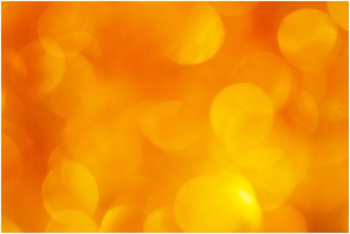 |
Orange...is a secondary color and can represent very charismatic and dynamic ideas. Because of its association with the changing season, orange is also connected to feelings of change and progression of life. Just as red holds many opposite symbols depending on the context, orange (like its fruity counterpart) can be associated with energy and health. Because it is a very vibrant, warm color that isn’t as dominating as red, it can draw attention with a more amiable tone. |
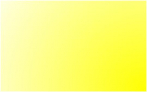 |
Yellow...is commonly considered the brightest of the warm colors because of its association with the sun and a cheerful attitude, but it is also connected with slyness and timidity. Lighter shades of yellow often break way from the excited tones attached to the bright shades, and instead give off a calmness, peace and tranquility, as seen with ribbons symbolizing hope, and used as a gender neutral color with children. |
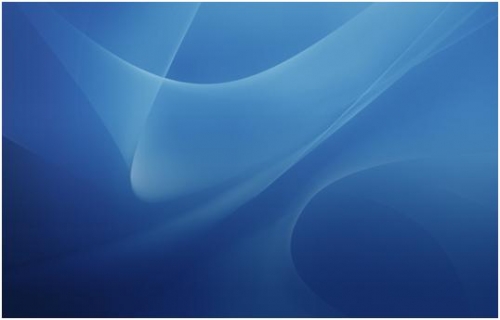 |
Blue’s...implications are greatly dependant on its shade and hue. Bright blues can denote refreshment and energy, where light blue colors denote calm and relaxation. Dark blues are very appropriate for company sites or in the sites that want to stress their dependability and strength. In the English language, blue represents sadness or depression. It is also connected with power and quietness. Lighter blues can express ideas of freshness and a friendly attitude. |
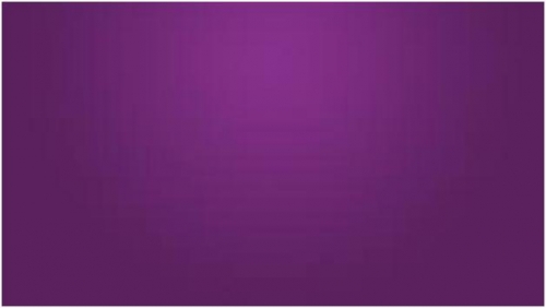 |
Purple...always brings about a sense of royalty or elegance. Because it is the combination of the primary colors red and blue, it contains both warm and cool characteristics. Generally it can represent fantasy and creativity; lighter hues can symbolize romance, and darker hues tend to be connected with aristocracy and luxury. |
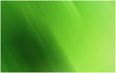 |
Green...is frequently used to express ideas having to do with earth, new life, and prosperity, while contrarily representing envy and hatred. Lighter greens can express energy and youth, while darker hues are associated with wealth and stability. |
Neutral Colors
Neutral colors can be great colors for backgrounds and mix very well in bright color schemes.
 |
Black...is a very strong color carrying with it charm, power and conventionality. Although this color can be very beneficial to a design with a positive theme, it can also represent death, evil and mystery; Western culture associates black with mourning. Contrarily, it is also a great choice for expressing elegant and contemporary ideas. |
 |
White...just like black, is a neutral that goes well with any color. It normally expresses purity and integrity, commonly used in weddings in the western culture. It is also a standard for many hospitals and healthcare providers, giving a feel of kindness and calm. White can also represent the summer or winter seasons. |
 |
Grey...can express a moody atmosphere, and used in place of white or black. In the right designs, grey can be very sophisticated and contemporary. Grey can also have hints of other hues in its tone to help it better match a color scheme. |
 |
Brown...is commonly related to earth, stone and wood. Its warm, neutral and natural color is associated with honesty and loyalty. Although brown typically goes well with most colors in the right scheme, if it’s used incorrectly it will come across as dull. When coupled with earthy textures like wood and stone it gives a feeling of warmth and gives a rustic mood. |
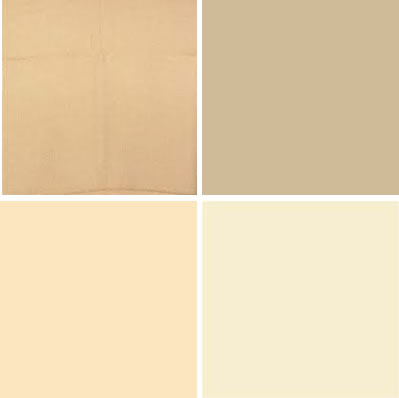 |
Beige, Tan, Cream, and Ivory...are all very subtle colors, but can be a great advantage to your designs when used correctly; they can give a feeling of calm and elegance. Because they contain the cool color of white as well as some warmer colors like yellow and brown, they create a balance between the two that allows versatility in their use. |
Summary of Color Interpretations and Symbolism:
Red |
Emotional, Love and Enmity |
Orange |
Vigor, Cheerfulness and Liveliness |
Yellow |
Confidence, Cunningness and Contentment |
Green |
Growth, Nature and Prosperity |
Blue |
Liability, Quietness and Depression |
Purple |
Imaginative, Prosperity and Royalty |
Black |
Bad or Evil, Occult and Gracefulness |
Grey |
Conventional, Rigid and Moody |
White |
Clean, Purity and Integrity |
Brown |
Reliable, Simplicity and Natural |
Beige and Tan |
Dullness, Conventional and Religious |
Cream and Ivory |
Calmness, Purity and Elegance |
Source: http://designmodo.com/color-concept/