The industry of your business has a bigger impact on the color scheme for your company logo than you may think.
On our Color Theory page, you learned that certain colors can bring about universal ideas, thoughts, and emotions....but what about the combination of colors?
Think carefully on your color scheme for you logo, branding and website design. Logos with many bright colors can be more engaging than others, but that doesn't necessarily mean they will be more successful.
| Color Wheel | Color Scheme | Example |
|---|---|---|
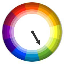 |
MonochromaticThese color strategies are formed with various color shades, complexion and tones of a particular shade of color. These schemes are quite easy to design and since these colors are of the same shades, at times it creates a harsh scheme. |
 |
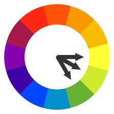 |
AnalogousThese color schemes are simple and also easy to create. On the color wheel (12 colors), these schemes consist of three consecutive colors. All analogous schemes have the same color intensity and they could be improved by including more shades, tones or hues. |
 |
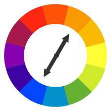 |
ComplementaryCombining colors that are opposite of each other on the wheel yields complementary schemes. They generally contain only two colors but can be amplified by additional tints, hues or shades. When we use colors that have the same intensity, the result could be very harsh. This can be avoided by adding a color in between or by using a white space. |
 |
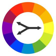 |
Split ComplemetaryThese schemes are just as simple as the complementary. In this scheme, you would use the colors on both sides of your opposite hue in the color wheel. |
 |
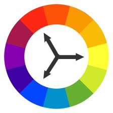 |
TriadicTriadic schemes are made up of equally distributes shades around the color wheel. These color schemes are difficult to balance but can be very vibrant and energetic. |
 |
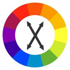 |
Rectangle (Tetradic)Tetradic or “rectangle” color scheme uses four colors arranged into two complementary pairs. This rich combination of colors offers a lot of variety. This scheme works best if one color is dominant. Warm and cool colors should also be balanced in your design. |
 |
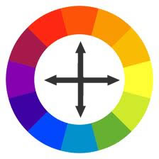 |
SquareThe square color scheme uses four colors spaced evenly around the color circle. Like the Tetradic, the square color scheme works best if you let one color be dominant. Again, pay attention to the balance between warm and cool colors in your design.
|
 |
